Stoxhero
Learn Without Losing
Fin-tech & Financial Education
About
StoxHero is a financial education platform where people learn to trade against live market data without risking money. Courses and analytics on one side, a real-time simulation on the other, built for beginners taking a first position and traders testing a strategy before committing capital.
Location
India
Services
Brand Strategy
Visual Identity
Research
UI/UX Design
3D & Animation
Marketing Assets
Challenge
Nobody avoids trading for lack of information. They avoid it because losing money while learning is a terrible way to learn.
StoxHero built a market you could practise in. The brand had to make it feel like a game to enter, and like the real thing once you were in.
Before
After
Competitive Analysis
Crew spend their working lives inside a small number of environments, the sky at first light, the We looked across StockGro, Groww, Robinhood and Classplus. The category runs one visual playbook,blue and purple for trust, green for growth, a friendly illustration to take the edge off. Follow it and you're credible but invisible.


Observations
Everyone signals trust with the same palette
Platforms pick a side: learn here, or trade here
Beginner tone reads as condescending to anyone already trading
Screenshots do the selling; the brand carries no weight
Insights
The category sells safety. StoxHero sells the freedom to be wrong
Competitors pick a side: learn or trade. The product refuses to, so the brand couldn't either
Practice is the position. Not education, not trading the gap between them
A simulated trade looks like a real one. What makes StoxHero worth choosing has to live in the brand
Strategy
Trading platforms sell confidence. Education platforms sell competence. StoxHero had both and was positioned as neither. So the brand sits in the overlap: the simplicity of education, the thrill of trading. Serious enough to trust with a real strategy, easy enough that a beginner doesn't feel underqualified opening it.
The test on every decision: would someone who's never traded feel invited, and would someone who trades daily feel it was built for them?


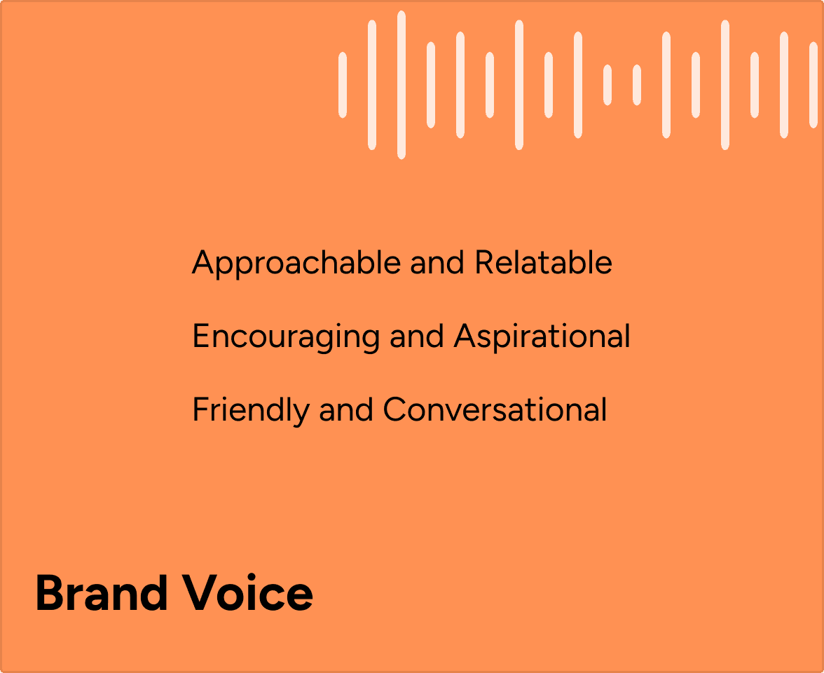


Identity
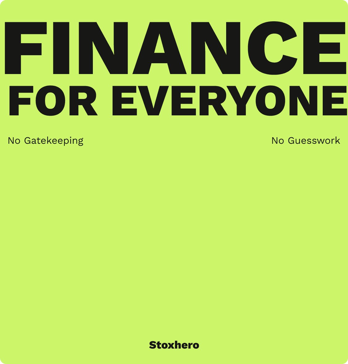
Finance signals trust with blue. We built the brand on near-black and acid green instead; dark enough to sit under charts for hours, bright enough that the eye follows the thing you're meant to do next.
Then we made it move. 3D objects and motion give a screen of numbers something to reward you with, and turn every completed step into a moment rather than a row. Progress you can feel is the difference between a platform you learn on and one you come back to.



Application
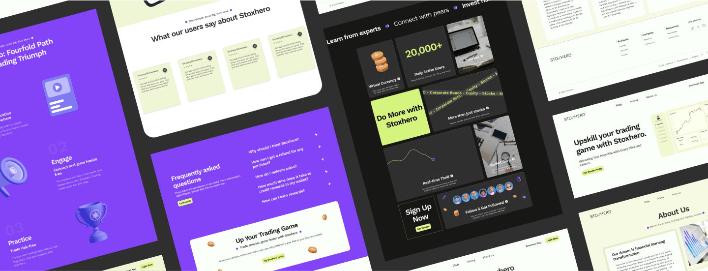
One interface, two people who want opposite things. A beginner needs fewer options; a daily trader needs density and speed. So the platform reveals depth instead of picking a level, full-strength charts for anyone who wants them, tutorials alongside, never compulsory. Nobody gets a beginner version, and nobody finishes a course before their first trade. Same rules across website, app and decks, so a slide in an investor room and a screen at 2am read as the same company.

Login screen
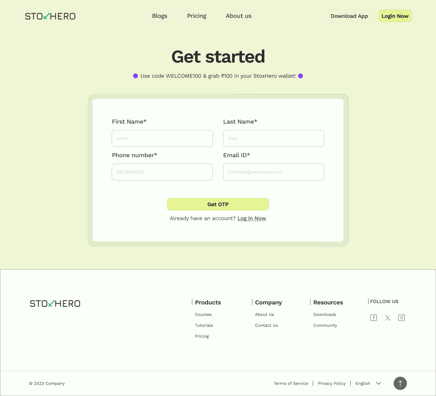
Sign-up screen
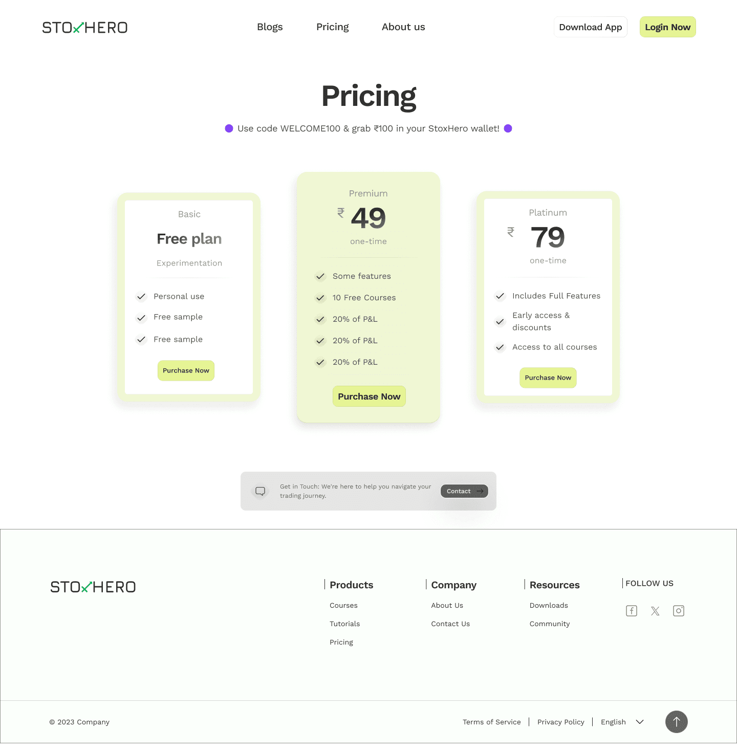
Pricing
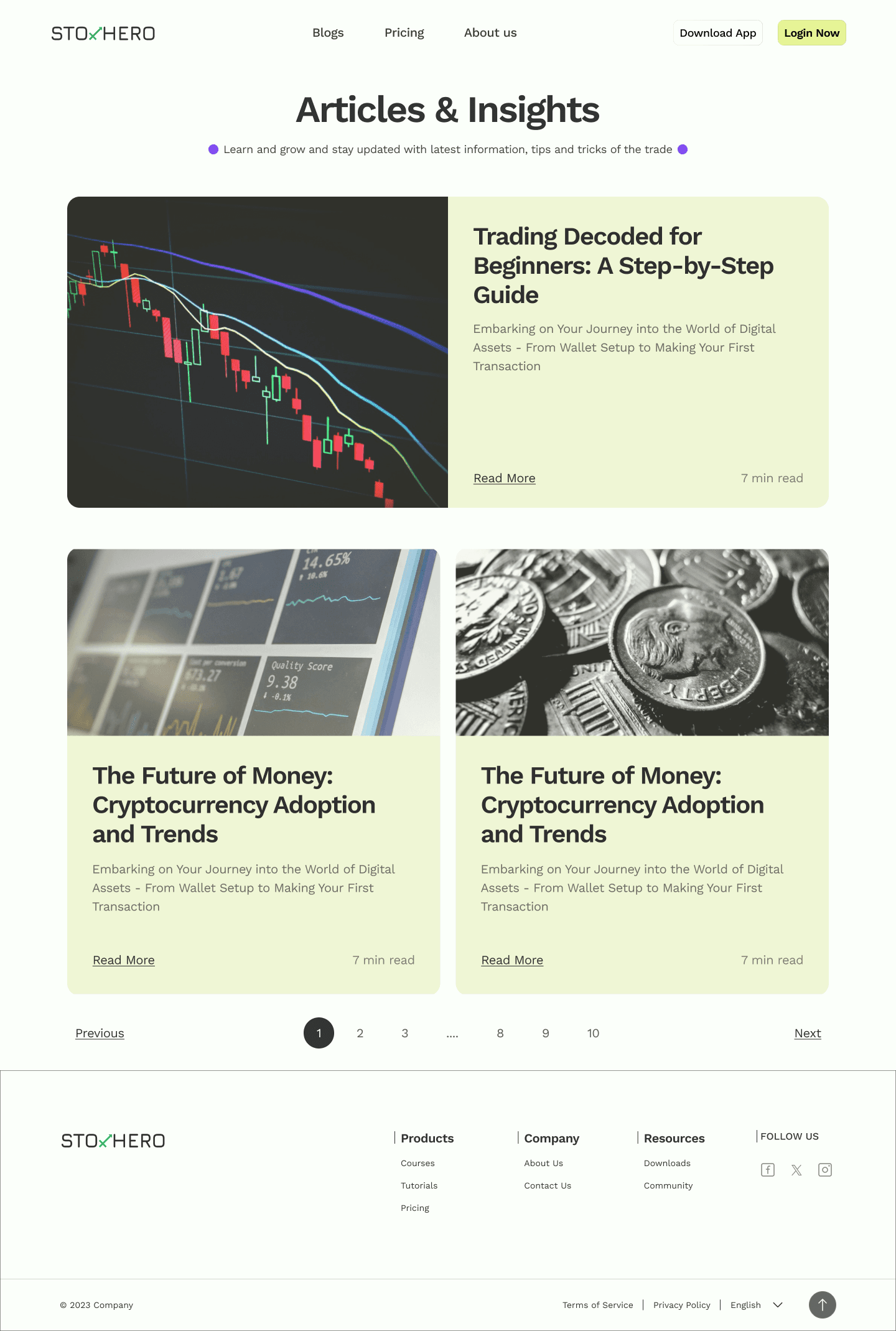
Blog listing page
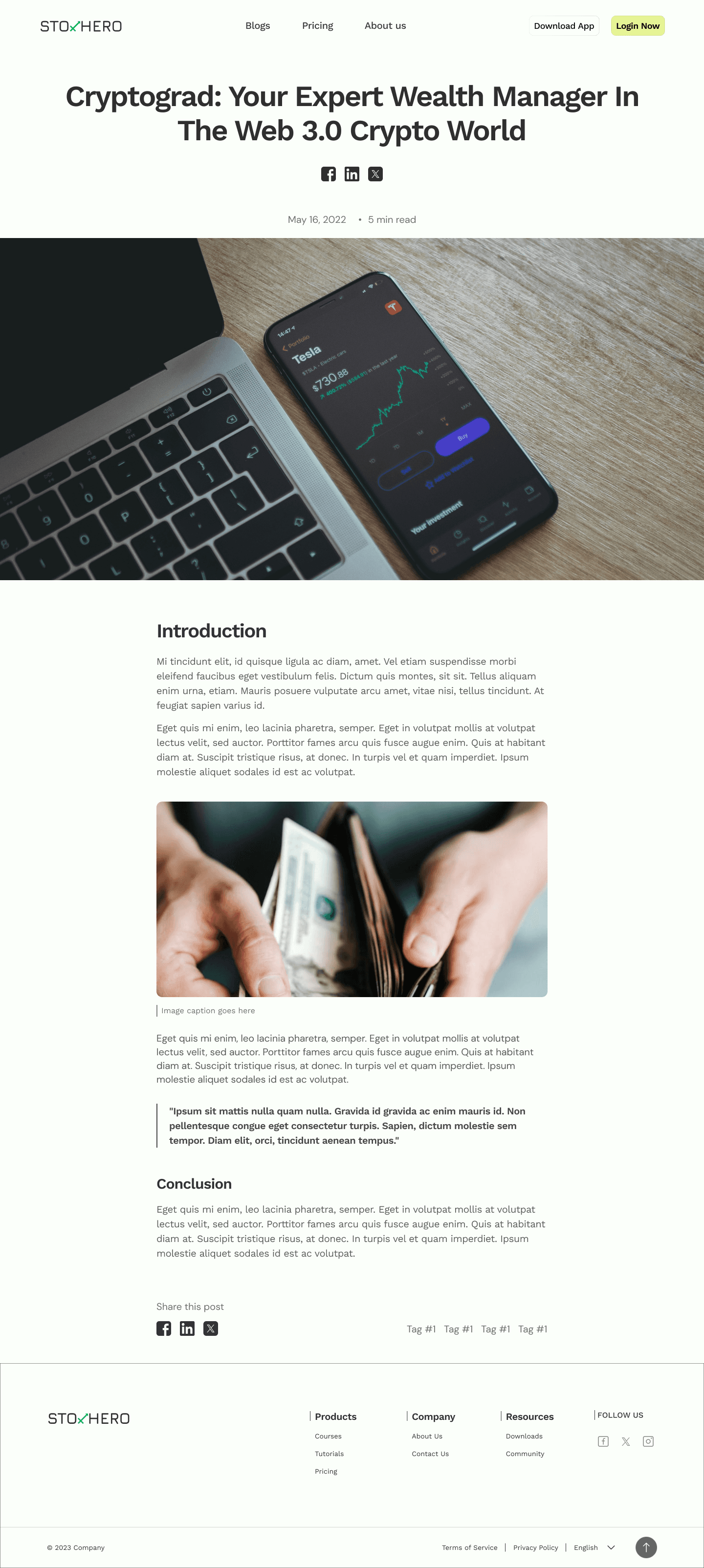
Blog page


Pitch Deck
Outcome
Sign-ups tripled after launch. Not because the product changed, it didn't, but because people finally trusted it enough to start. In a category where everyone claims safety, looking capable turned out to be the thing that converted.


